01 · the idea
Bauhaus + De Stijl, made readable.
MakeMode lets non-coders turn a vision into real, working software — built and hosted in the EU. The brand has to feel like that promise: honest, structural, human, European. Form follows function · flat & honest · the grid is law · colour is function. This page is the applied brand kit; the program-wide system lives in DESIGN-SYSTEM.md.
02 · the logo
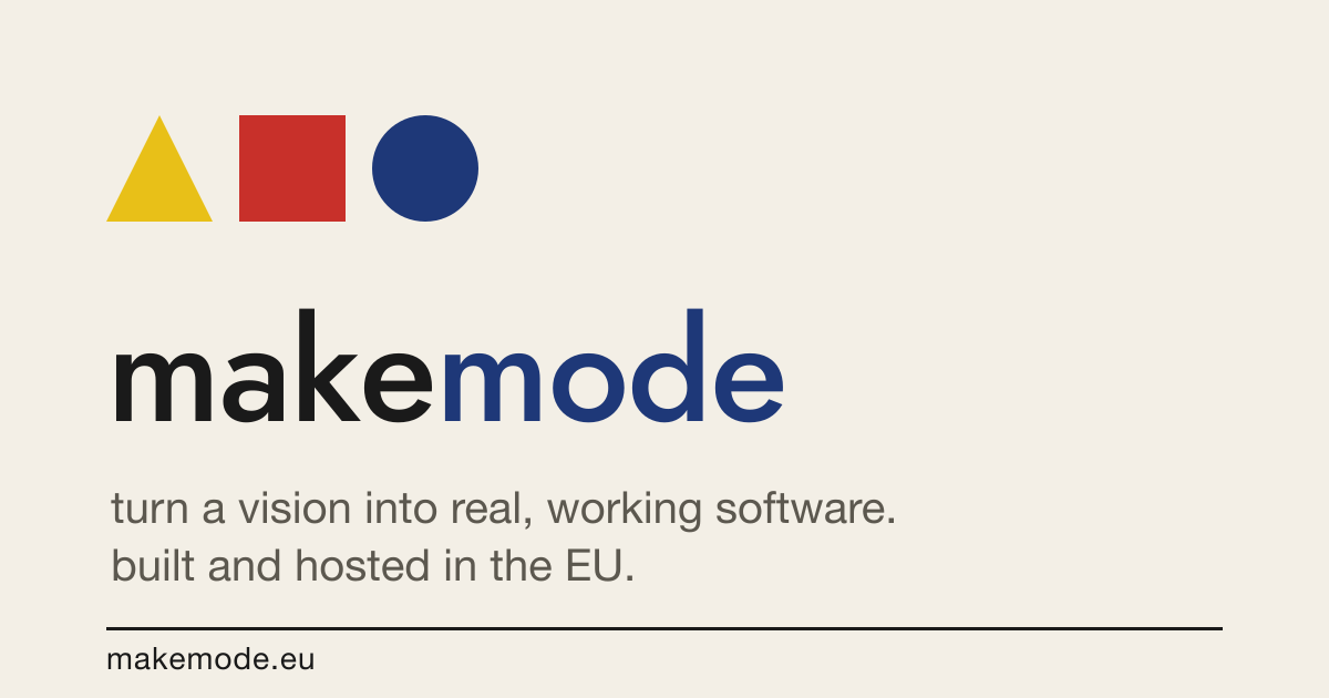
The mark & the wordmark
The mark is the triad — a yellow triangle · red square · blue circle (Kandinsky/Itten). The wordmark is makemode, always lowercase, one word, geometric sans; mode is blue. All logos are outlined vectors — they render the same with or without Jost installed, and every SVG has a PNG twin in logo/png/.
03 · clear space & minimum size
Give it room
Keep a margin of one shape-height (the square's height) clear on all sides. Minimum: horizontal lockup ≥ 120 px / 32 mm wide; mark alone ≥ 24 px / 8 mm. Below that, use the mark, not the lockup.
04 · colour
The triad is the palette
Colour is function, never decoration. Blue is the brand and the only interactive colour. Red and yellow are fills only — never text on paper. Ink and blue are the only text-on-paper colours. Click any hex to copy.
05 · typography
Jost for display, humanist sans for reading
makemode
Jost (OFL) · geometric · lowercase as a signature
Display & short labels: Jost — an open geometric grotesque in the Futura lineage (lowercase signature). Reading text: humanist system sans, sentence case, AA contrast, ~66ch. Code/telemetry: Berkeley Mono.
06 · expressive register
The expressive register
The product brand above is calm on purpose. Marketing and posters get a louder, expressive register — full-field colour grounds, big lowercase display, and De Stijl block compositions. Two finished devices live here; the full series is the poster wall (see also DESIGN-SYSTEM §5 & §11).

The EU badge is the triad's blue circle read as the European flag — twelve triangles for the stars, eu at the centre. Use it for "made in Europe / nothing leaves the EU" trust marks. The polder pattern is the sovereignty metaphor (land you make & keep) as a Mondrian field — for covers, section breaks, and social backgrounds. Expressive-register only; never in product UI.
07 · usage
Do & don't
Do
- Use the colour lockup on paper or white; ink or paper variants elsewhere.
- Keep one shape-height of clear space around it.
- Reverse to the paper variant on dark or coloured grounds.
- Use the mark alone when small or square.
- Pair colour with shape + label — never colour alone for meaning.
Don't
- Recolour the shapes, reorder them, or rotate the mark.
- Set the wordmark in another font, capitalise, or stretch it.
- Add shadows, gradients, outlines, or 3-D — stay flat & honest.
- Use red or yellow as text on paper.
- Place the colour logo on a busy photo or low-contrast field.
08 · voice
Access, not AI-hype
Start with the why: a design student or researcher getting from an idea to a shared link, on EU rails. The story is access — non-coders building real software — not "AI does it for you." Human, user-first, plain, no emoji. And "polder" is the sovereignty metaphor on purpose — don't rename it.